While working at Triad Partners, I was asked to design business cards for Unified Legacy Advisors using the company's established identity.
03 / 06Client Design / Brand Identity Exploration / Motion
Unified Legacy Advisors
Making legacy feel current.
RoleBusiness Card Designer / Independent Brand System DesignerProjectClient Design / Brand Identity Exploration / Motion
ULAUnified Legacy Advisors
Separate paths become a shared centerAn approved business card design completed through Triad Partners, followed by a clearly separated self initiated exploration of how the existing identity could operate as a broader visual and motion system.
Client Assignment with Self Initiated Extension2024Two weeks
- Brief
- Design a polished, practical business card system consistent with Unified Legacy Advisors' established brand, then independently explore how that language could extend into a broader contemporary system.
- Role
- Business Card Designer / Independent Brand System Designer
- Deliverables
- Approved business cards; self initiated identity, orbital mark, wordmark, motion behavior, and visual system extension
- Outcome
- The business card design was approved as reliable, cohesive, and consistent with the existing brand. The identity and motion work shown afterward is an independent conceptual extension.
Business card design and self initiated identity and motion extension by Julia Hantla.
The approved
business cards.
Shown in full, at their original proportions, with every edge and production guide visible.
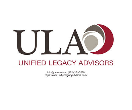
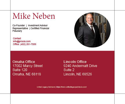
Original client work completed through Triad Partners
I incorporated agency and client feedback while maintaining consistency across type, color, layout, and presentation.
The final business card design was approved and positively regarded as reliable, cohesive, and consistent with the existing brand.
Client work ends here.
Independent exploration begins below.
I expanded the existing visual language into the identity and motion study below. This extension was not commissioned or adopted by the client.
Trust,
in motion.
An orbital mark frames legacy as connection and movement. Layered circles suggest families, futures, and values moving through time.
Independent paths move toward a shared center, making legacy feel active rather than inherited.
Why it works / The behavior carries the idea.Separate circles create one mark for connection, continuity, and shared direction.
Why it works / The symbol is both modular and whole.Geometric weight signals authority; open spacing keeps it current and human.
Why it works / Trust without the category cliché.Rings enter separately, align, and reveal the wordmark.
Why it works / Sequence explains the system.A Pride extension broadens the orbital language to more definitions of family and legacy.
Why it works / The mission expands, not just the palette.The mark / Construction
Five orbital forms keep their individuality while producing one ownable center.
ULA
The wordmark / BehaviorThe letters enter independently, lock to one baseline, and hold with confidence.
LEGACY
IN COLOR
The extension / Pride MonthIN COLOR
The expanded spectrum appears across orbital crops, headers, social frames, and motion. It is an intentional expression of a broader legacy.